The Gateway Science Museum envisions an environment where people of all ages and demographics are inspired by science. They strive to be a leader in engaging youth in Science, Technology, Engineering, and Math (STEM). Gateway Science Museum serves as a portal to learning and sharing, connecting Chico State’s university and community in a strong partnership.
As a Marketing and Design Assistant at Gateway Science Museum, my roles varied from lead exhibit designer to graphic designer. The majority of my time at Gateway was spent curating a summer 2024 exhibit for the community. This project included various components from spatial design to interactive design, and creating the overall look and feel of the exhibit. Alongside the Gateway team, I worked to improve the user journey of the exhibit and craft marketing materials to showcase this new attraction to the community. I also acted as the sole designer to create a visual identity for Gateway’s new outreach initiative “Gateway Connects”.


Shadow & Glow: Nature’s Nightlife
Summer 2024 Gateway Science Museum Exhibit
As the lead exhibit designer for Shadow & Glow: Nature’s Nightlife, I conceptualized the vision for this new summer exhibit. With the hot summer months in Chico, we wanted a space for the community to cool off and learn valuable information about our nocturnal species. This project lasted from March 2024 with our opening date July 25th, 2024 and ended September 7th, 2024.
Our Designated Space: The North Gallery
The North Gallery is the largest exhibit space at Gateway Science Museum. This room has no windows which allowed for us to be able to create a seamless “night time” atmosphere. With the space, myself and our team decided that having various nocturnal ecosystems would be best for our visual storytelling.


Spatial design and layout for Shadow & Glow: Nature’s Nightlife. By utilizing black out fabric hanging from the ceiling we planned on creating various sections for our users to navigate through. 2D layout was created in Adobe Illustrator and 3D modeling was created in Adobe Dimensions to create a visual blueprint.


3x6 ft interior panels for each biome in the exhibit. Text features species that are highlighted through interactive features in the space. For the design, I wanted the panels to feel cohesive and appeal to our youth demographic. The typography chosen consists of two san-serifs for easy legibility and hand drawn graphics with distinctive silhouettes.
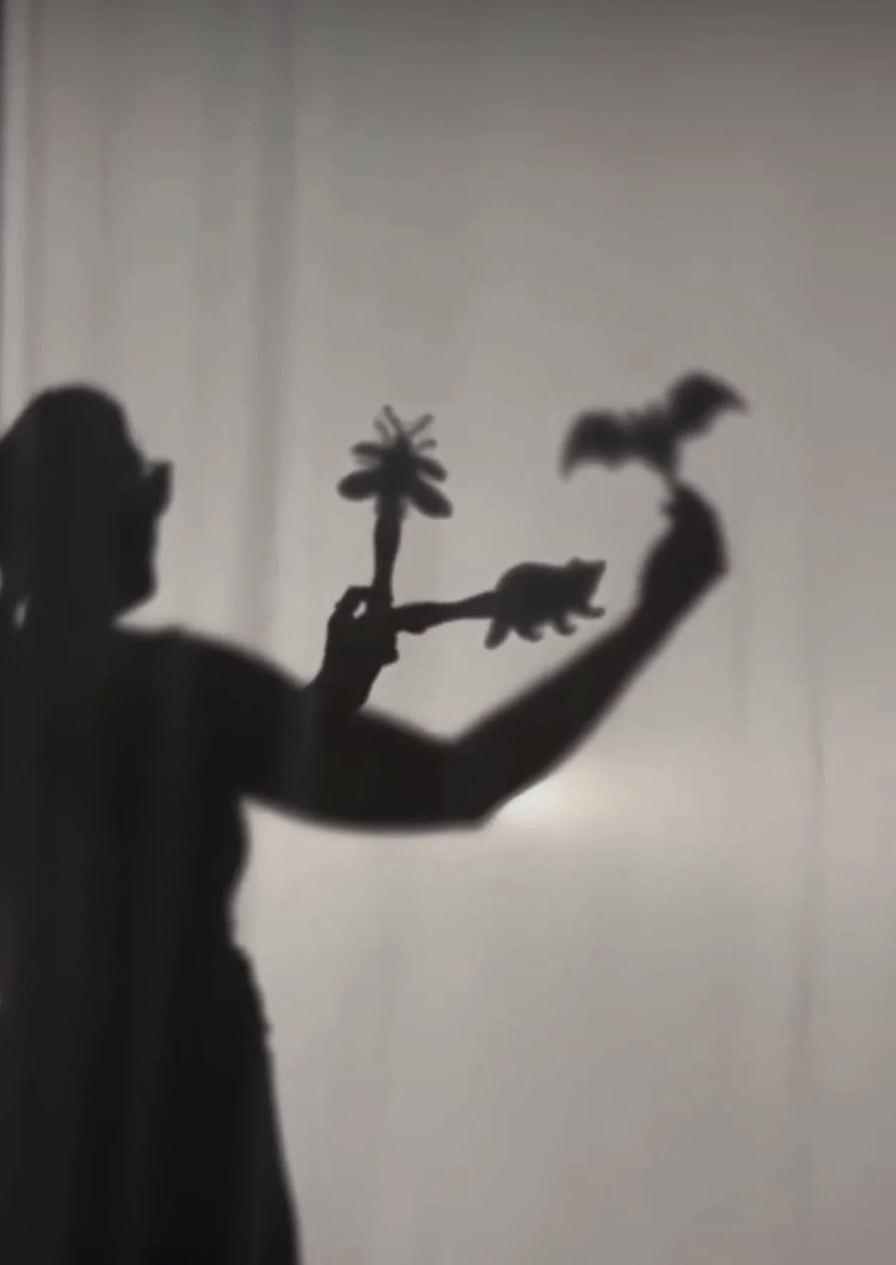
Exhibit Interactive Features
Shadow-Casters
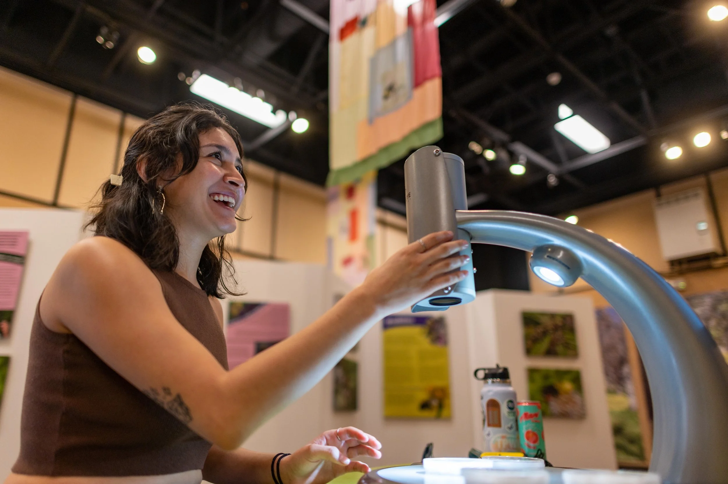
As we began to think about what interactive elements we wanted to feature in our exhibit, the idea of users carrying around their own flashlight came into the picture. We wanted our audiences to feel like they were lighting their way through the night, uncovering biodiversity at every turn. To create large projections of different nocturnal animals, I created artwork with negative space that was then laser printed on acrylic. When exhibit goers entered the space, they were given a flashlight to put up to the shadow-casters to unveil a large-scale projection of the species. All artwork was digitally drawn by myself and then vectorized in Adobe Illustrator.
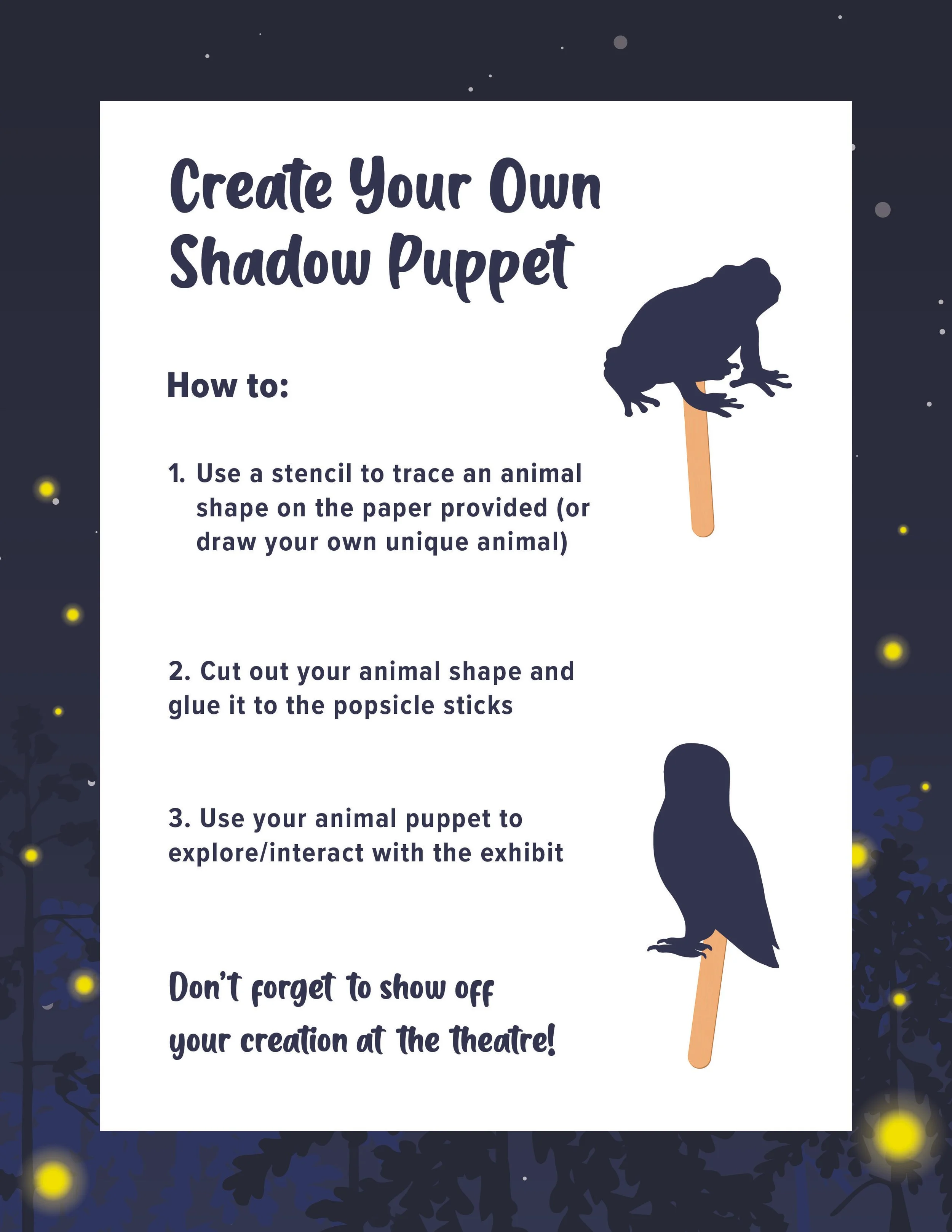
Make Your Own Shadow Puppets
Since a majority of our demographic is children, we wanted to have another element that would appeal to them. In our initial spatial mock-up, we had a designated space for a shadow puppet area that kids could play in and experiment with the science of shadow puppetry. From the shadow-caster artwork, I made templates our users could trace onto card stock to make their own. Our team set up a whole area in the front of the exhibit where museum goers could make their own shadow puppets and other crafts to showcase at the theater.

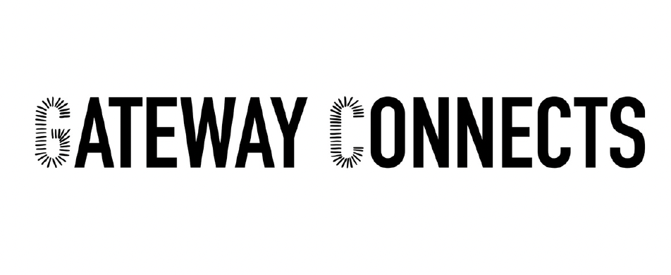
Gateway Connects
2024 Marketing Campaign Logo
As an entity of California State University, Chico, Gateway Science Museum wanted to promote their relationship to campus and the community. Through visual storytelling, our team decided on the name “Gateway Connects” to promote the museum’s connection to the university. For this project, I was the sole designer of this logo mark that will be used across various marketing materials and medias.


1
2

3
4
On the left you will find initial sketches that I started my process with. As a team we decided to lean into a scientific approach, and we wanted to have unity between the words.
Revisions
Exploration of Concept 2
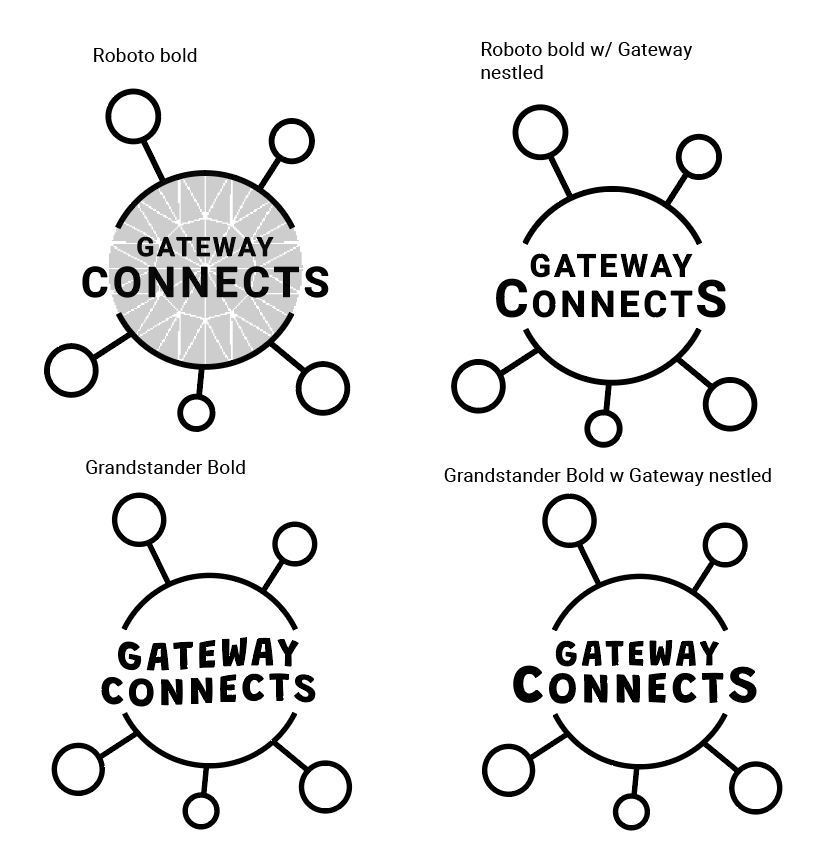
From the initial sketches, our team and executive director wanted to look further into developing concept two. I focused on shape and got a feel for what kind of typography they wanted to see. The molecular graphic was a favorite with our team because each connection point could stand for a value in our campaign.
Typography
For the next phase of development, we wanted to either implement Roboto or Grandstander as the chosen typeface. These were given to us from the University’s visual guidelines.

Final Revisions
With the new typography in mind, we took the concepts our team favored and applied them to the molecular graphic. The idea of taking the current Gateway Science Museum spoke logo and adding it to this was also brought up in our brainstorming, so I added this to the equation. However, I believed this concept was not as strong due to the crowded, outdated feeling it presented. After we discussed the direction to go in for our final logo, we agreed that Grandstander would be the most appropriate typeface. It had more personality and appealed to our intended demographic more efficiently.